Choosing Your Wedding Colors
How to build a palette from the place, the season and the light — and why the best color schemes have one strong color, a few quiet ones, and a great deal of white space.
Color is the easiest place to begin planning how a wedding will look, and the easiest place to overdo it. The weddings people remember visually tend to use fewer colors than you’d think, used with more confidence. Here is how to arrive at a palette that looks deliberate rather than assembled.
Start with what you can’t change
The venue already has a palette. Wood paneling, red brick, white plaster, stone, a garden in full green, a ballroom’s gold and cream carpet. Your colors will sit against it all day and in every photograph. Walk through it and note the three or four colors that dominate; your palette should agree with them or contrast deliberately, never fight them by accident.
The season supplies the rest. Spring light is cool and clear, and suits soft, fresh colors — blush, butter yellow, pale green, lilac. Summer can carry saturated color. Autumn is rich and warm: rust, ochre, deep green, burgundy. Winter suits jewel tones, deep neutrals, metallics and candlelight. Flowers by season shows what blooms when — the cheapest way to get color is from flowers that are abundant anyway.
Build the palette
A palette that works almost always has three parts.
One lead color. The color people will remember. It might be in the bridesmaids’ dresses, the flowers or the stationery, but it should appear in more than one place.
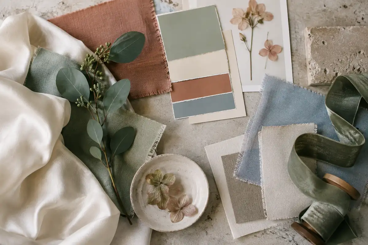
Two or three supporting colors. Usually quieter shades that sit beside the lead — a deeper and a lighter version of it, or a neighbor on the color wheel. Sage, eucalyptus and olive around a terracotta. Navy and dusty blue beside ivory.
Neutrals, generously. White, ivory, cream, stone, natural linen, wood, greenery. Neutrals are what make the colors look chosen rather than scattered. The most elegant weddings are often mostly neutral, with color used sparingly and on purpose.
Neutrals are what make color look chosen rather than scattered. The most elegant weddings are often mostly neutral, with color used on purpose.
Test it
- Collect real swatches — fabric from the bridesmaids’ dress maker, ribbon, paper samples from the stationer, a few stems from the florist — and look at them together.
- Look in the venue’s own light, at the time of day of the wedding. Candlelight turns everything warm; fluorescent light turns it green; daylight in a white tent is almost blue.
- Photograph them. Some colors look beautiful in person and muddy in photographs, particularly very pale pastels and some bright pinks.
Where color works hardest
- The wedding party. Tones of one color — sage, olive and eucalyptus, say — look richer than one color repeated and flatter a group of different people. See dress codes, decoded for how to brief them.
- Flowers. The largest mass of color in the room and in the photographs.
- Stationery, which sets the palette for guests weeks before they arrive. Invitation wording covers what to say on it.
- Table linens and candles, which do more for the room than elaborate centerpieces.
A note on white
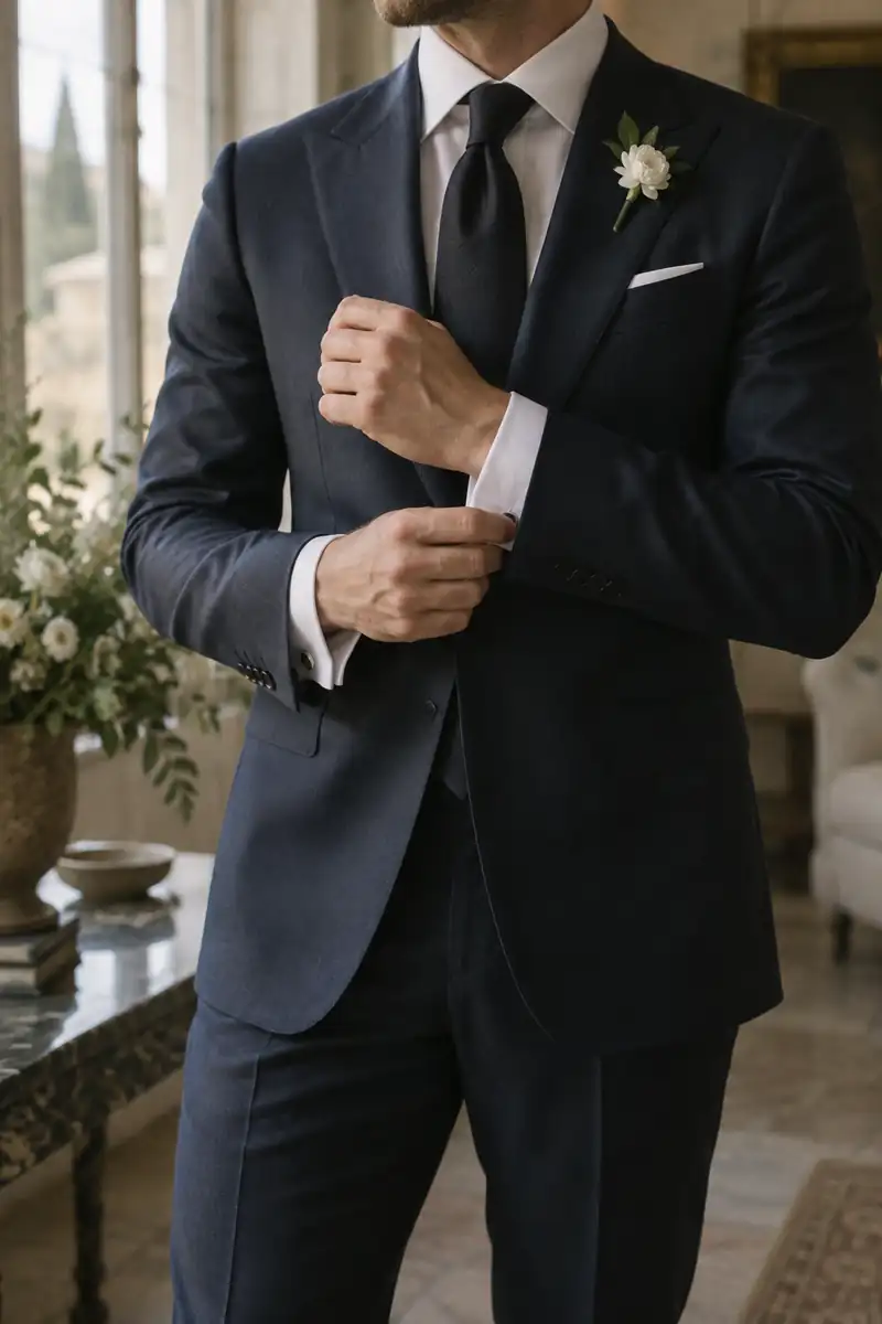
If the dress is ivory or champagne rather than bright white, keep bright white away from it — in the groom’s shirt, the flowers and the table linens — or the dress will look yellow beside it. The Wedding Dress, Decoded explains the shades of white, and the groom’s suit how to dress beside them.
For themed weddings built around a color or an idea, the archive’s collection of theme weddings goes back to 1999 — and some of its ideas, like a candlelight or autumn wedding, have aged very well.
Written and edited by the Today’s Weddings editors. How we research and check what we publish is set out in our editorial standards. Spotted something wrong? Tell us.